
Broadridge
Design System
Design Systems are the single source of truth to a company’s product experience. Prior to this project, Broadridge relied on an outdated style guide that had little exposure. Recent Broadridge endeavors increased the corporate’s interest in a much more design oriented environment thus leading to my team’s creation of Broadridge’s own Design System.
My Role: Lead UX Designer, Product Designer, UX Researcher
Tags: Product Design, UX Design & Research, Design Systems, FInance
The Research
Business Justification
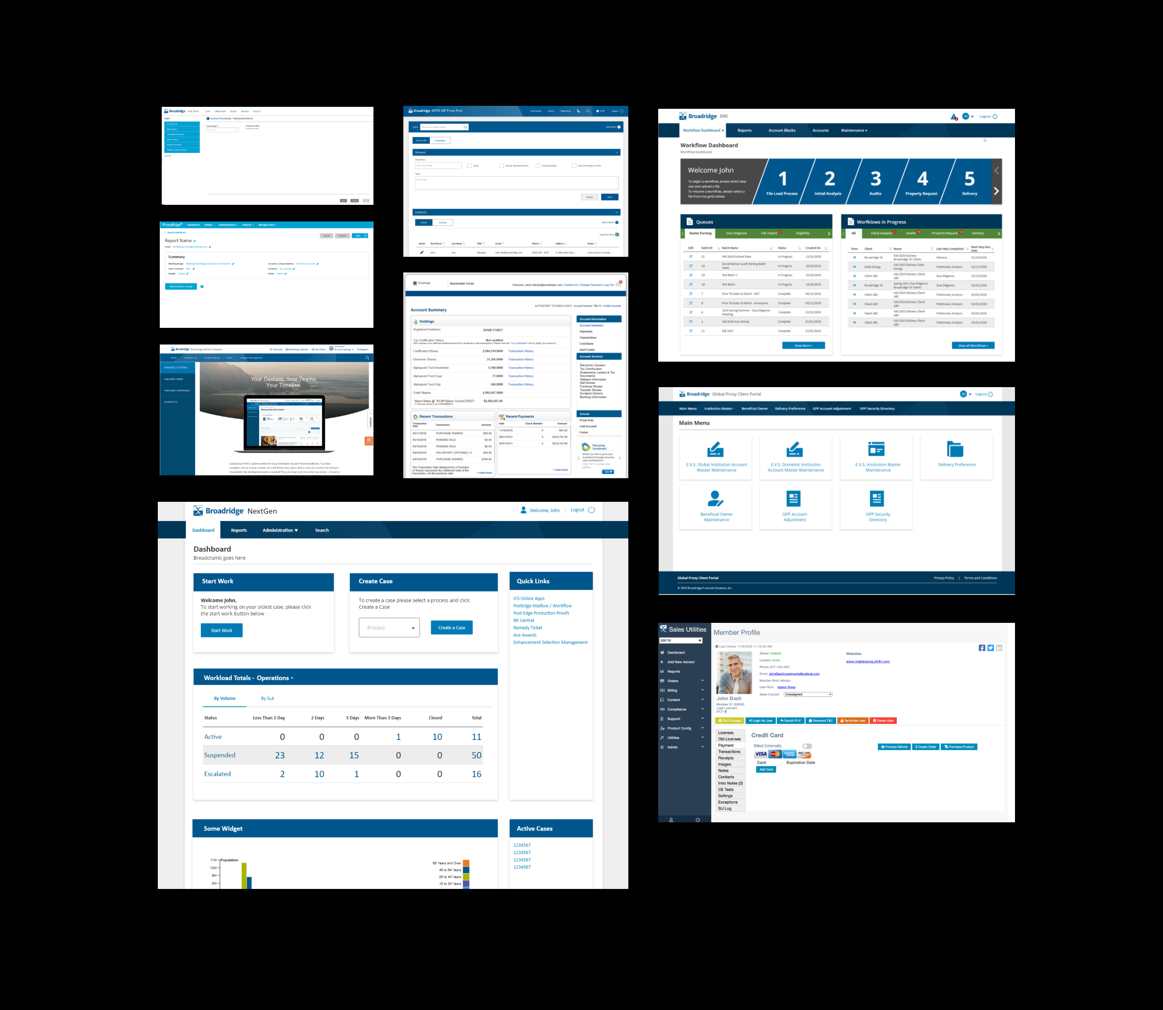
Broadridge consists of several product teams managing dozens of both internal and consumer facing applications. 60-75% of these applications do not follow a consistent look and feel and have disconnected components. This is often due to unaligned teams and individuals. A design system aims to solve this by providing a structure and a guide for product teams. The following are examples of common questions the UX/UI team would get prior to the creation of a Design System.
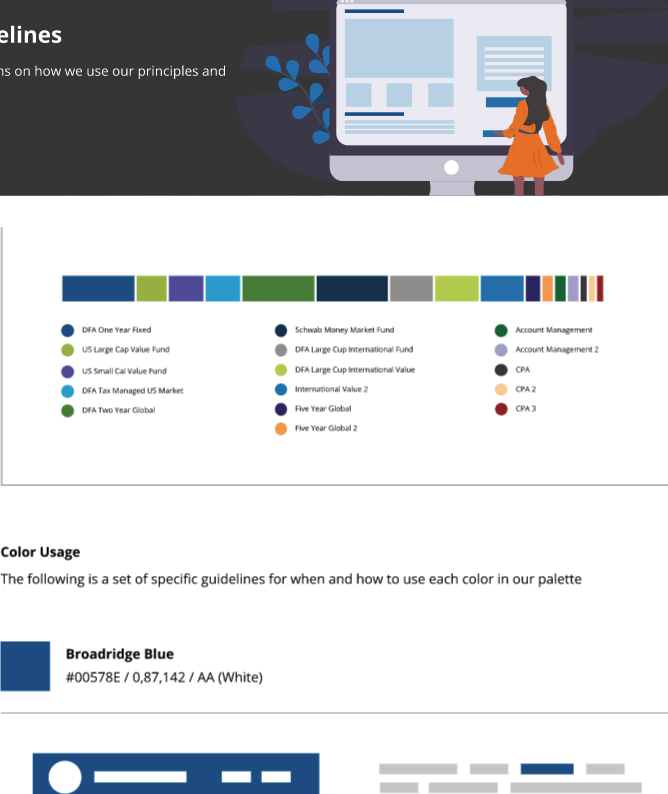
"What colors should I use for this graph?"
"Where should I place this button on this page?"
"What should a Paragraph look like?"
The following Grid shows some of Broadridge's Applications before a Design System was created
The goal was to streamline and make the design process as efficient as possible between Designers, Developers and the Business Team. The goal is not to reinvent something drastic but rather to create and/or improve on UX/UI components and patterns and host a digital platform for users to easily read and understand.
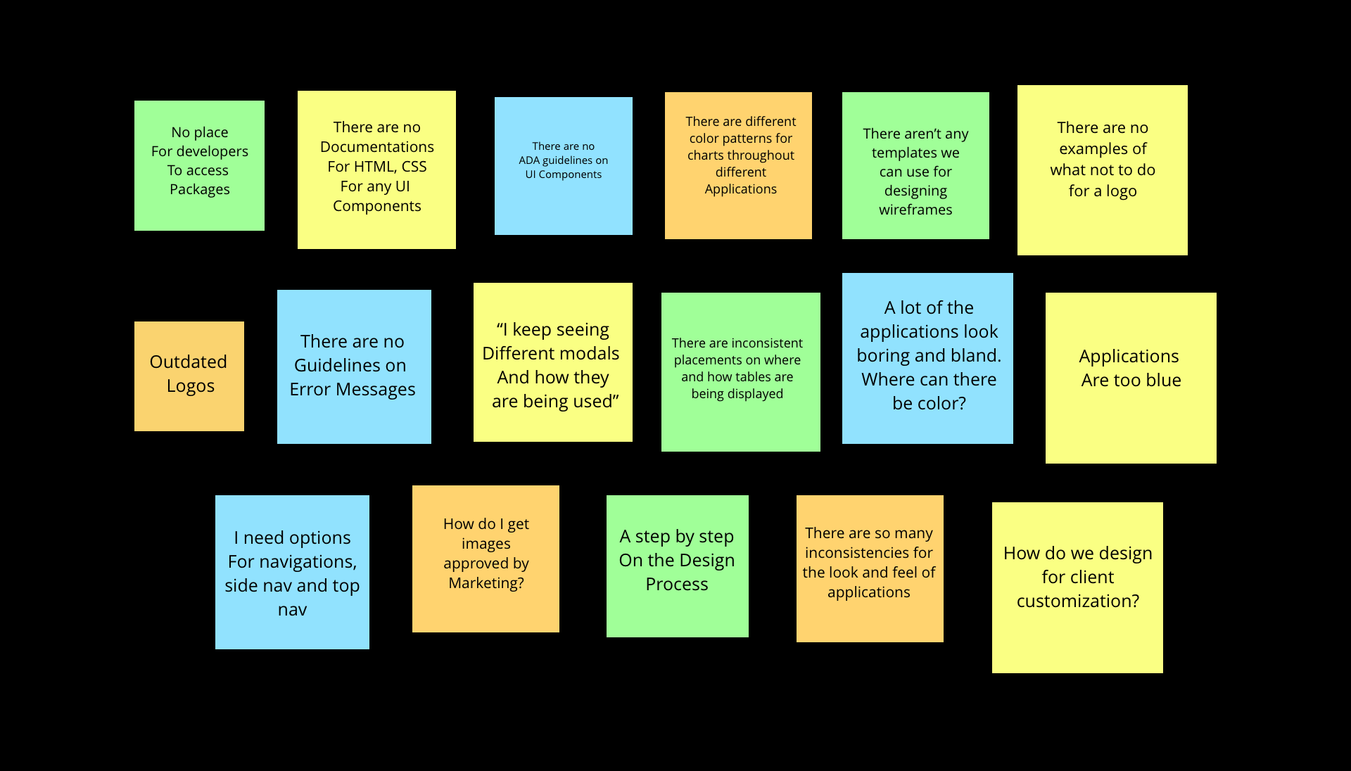
User Pain Points
The following is a collection of Post Its showcasing Pain Points by users researched by the UX/UI Team. A Pain Point workshop was conducted to gather insights from Interviews and Feedback. The users were a mix of Internal Broadridge Associates that are UX Designers, Developers, Product Managers and Marketing Associates. The interviews that were conducted aimed to gather pain points from these users that would subsequently be solved by the creation of a Design System.
Inspiration Analysis
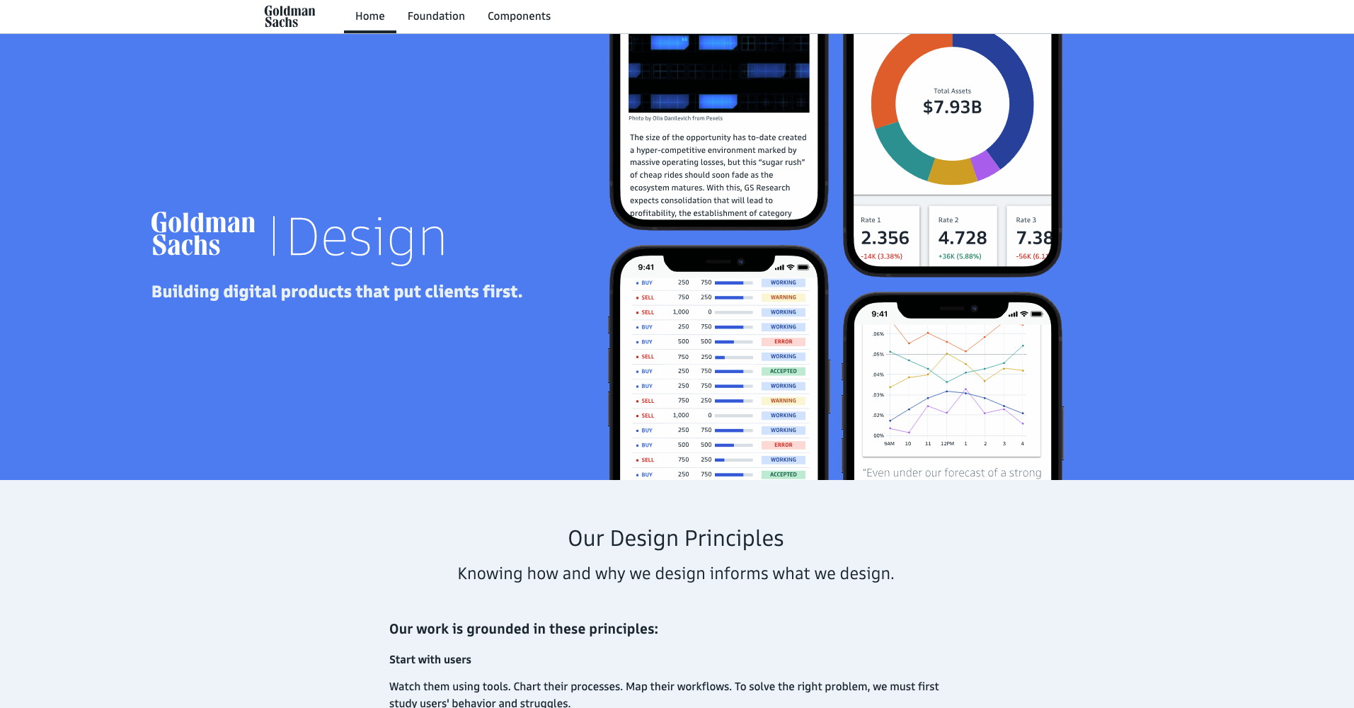
Goldman Sachs
Key features: Easy to use navigation and site architecture, Great explanations and examples for each components, implements Accessibility well, does not overwhelm users, Extremely in depth, Same industry as Broadridge
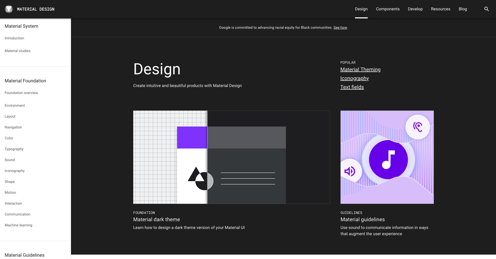
Google's Material Design
Key Features: Live components, Consistent with Broadridge’s Product components, Easy to use navigation, Customizable on web to demo, Well-known,
Applications Audit
Through the help of other designers throughout Broadridge, we created a matrix of all the different applications we could get a hold of. The goal was to come up with common patterns which we all thought were successful and on parr with a great UX Experience.
Personas and User Insights

Adam Steiman
Front End Developer
Likes everything laid out. Very experienced with code. Knows different front end libraries.
Key Insight: He wants a single source of templates and packages for starting an application

Monica Lavar
UX Designer
Likes visual examples. Likes everything to be simple. Adept at learning UX patterns. Already skilled at UX.
Key Insight: He wants examples of repeatable UI patterns and guidelines he could use for designing his applications

Sarah McBeth
Product Owner
Likes visual examples of other applications. Likes things to be well documented.
Key Insight: She wants documentation of everything to reference on her files. Needs ADA references.
The following were some tentative solutions from a Solution Workshop conducted by the UX/UI Team

The Ideation
Chosing The Right Components
Most UI/UX components used in financial industries are already established. A great UX/UI strategy is to ensure users use what they already have good expectations of. Furthermore, it would be a bad idea to drastically change the UI library of all existing applications according to some of the fears users have expressed. The UX/UI team chose these three factors when choosing UX components:
1. Ease of Use and Intuition
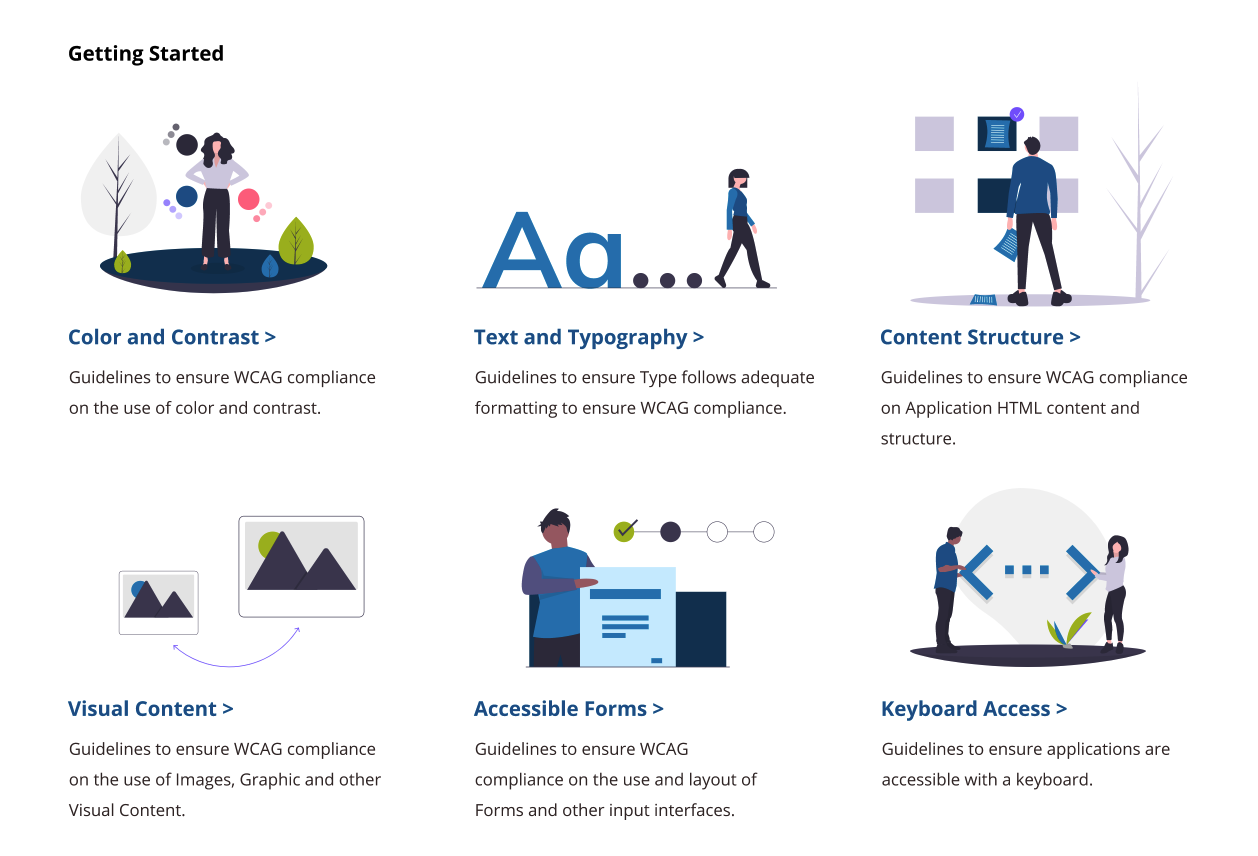
2. ADA Compliance
3. Passes the basic laws of UX
Material Design
The UX/UI team selected Material Design as the UI library for all internal and external Broadridge applications. Why Material Design? It effectively is, in its own, a design ecosystem. Material Design, owned by Google, already has a complex set of rules and documentations of all its components. Other factors were:
1. Haptic Feedback
2. Subtle Animations
3. Simplified sense of Physics
4. Designed for Mobile First
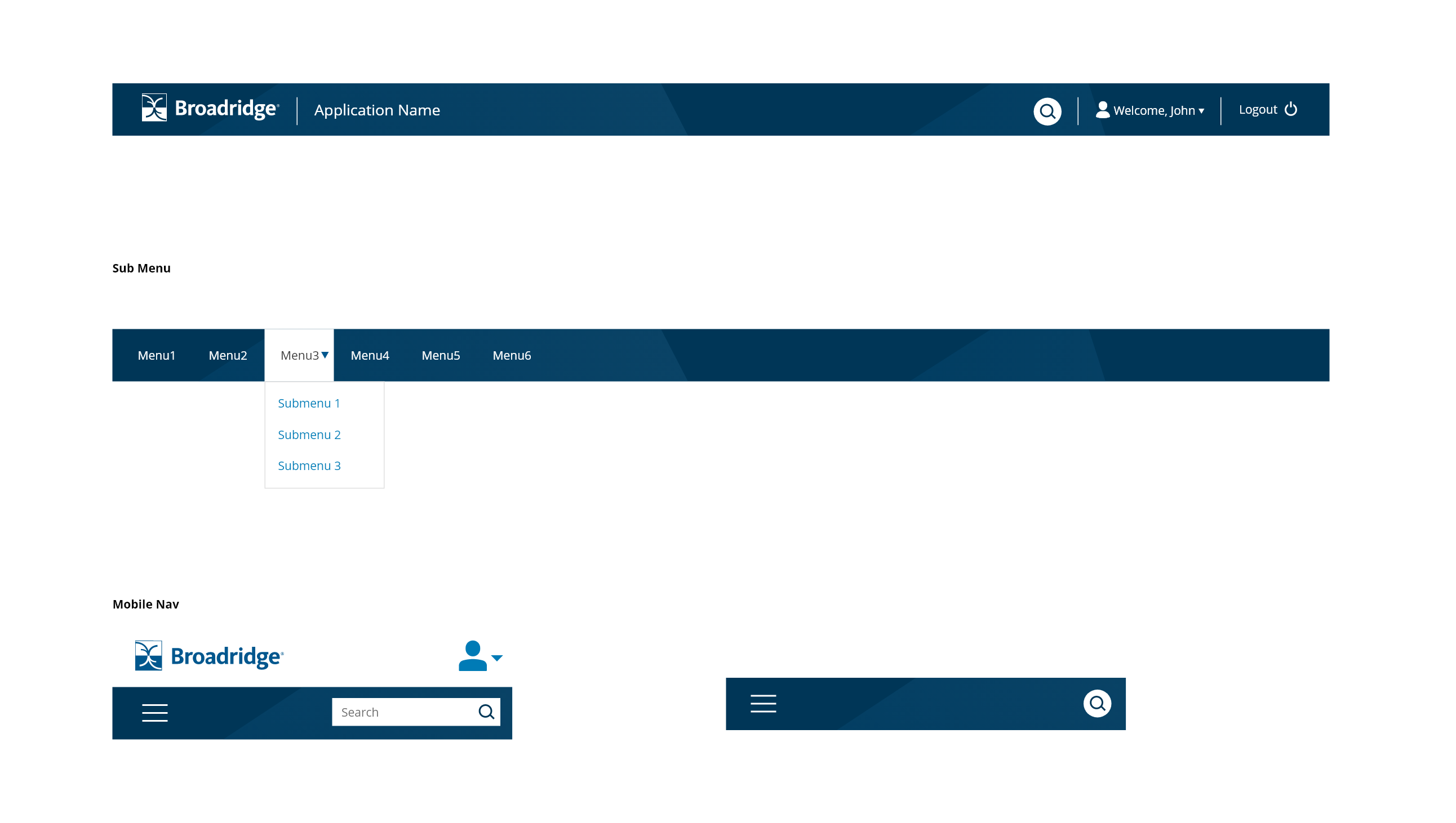
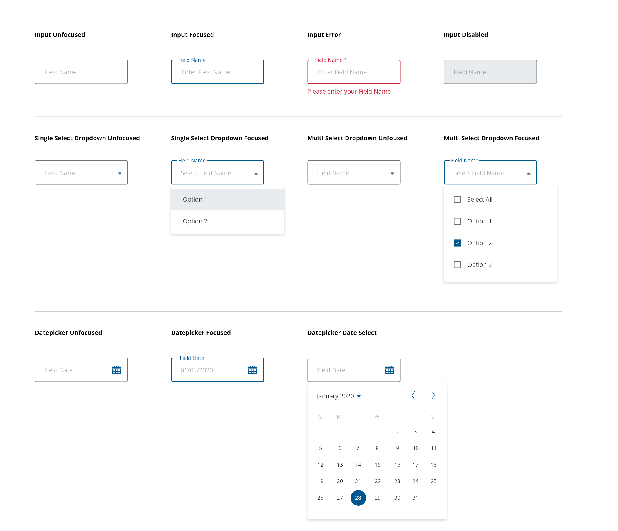
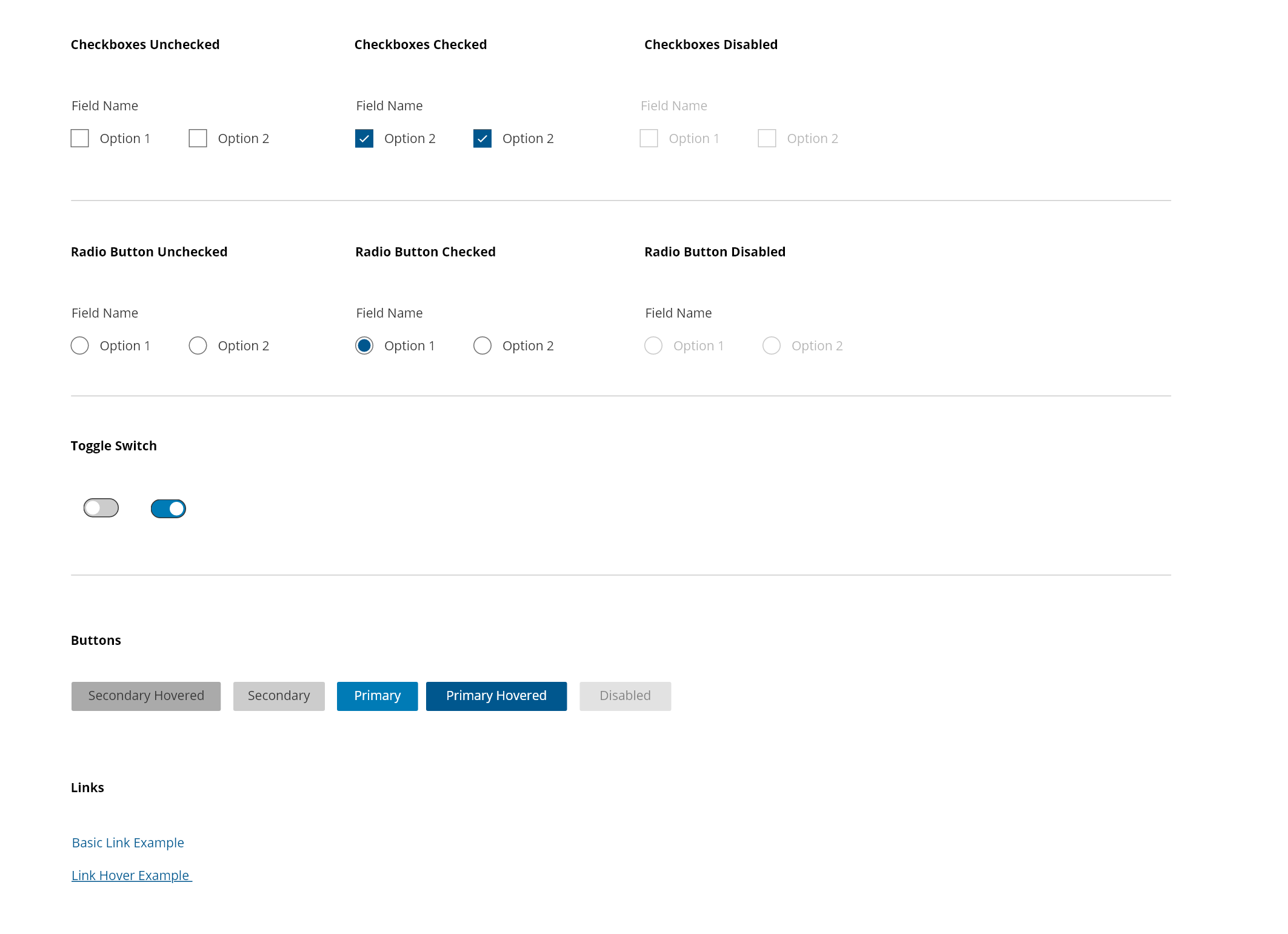
The following UI Components were customized according to Broadridge Design Standard
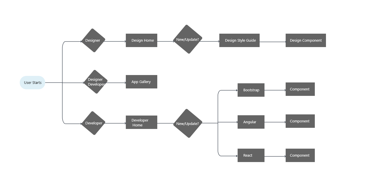
The Digital Platform and Userflows
After the team has selected the UI components and libraries. It was time to create the digital platform for the Design System. Using the insights found from the research and interviews, the personas were used as the users for the design. User Journeys, Site Architecture Flows and Low Fidelity Mockups were used to engineer design solutions appropriate for the personas.
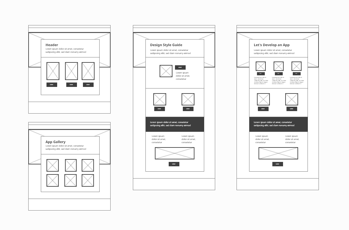
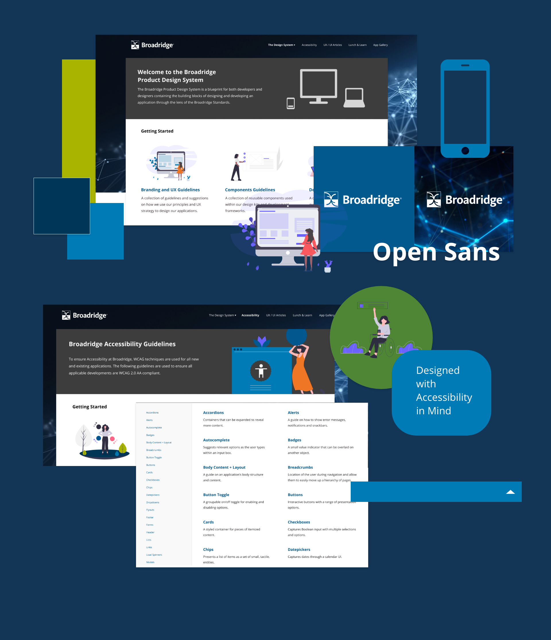
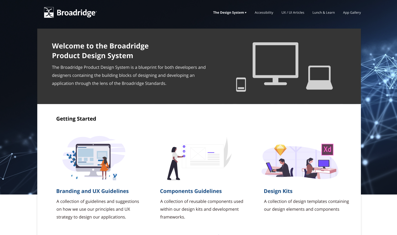
The Final Design
The following is a grid with images of what the final product looks like.
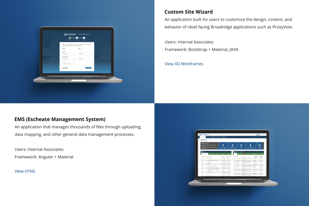
The following is a grid of Applications that started using the design system.

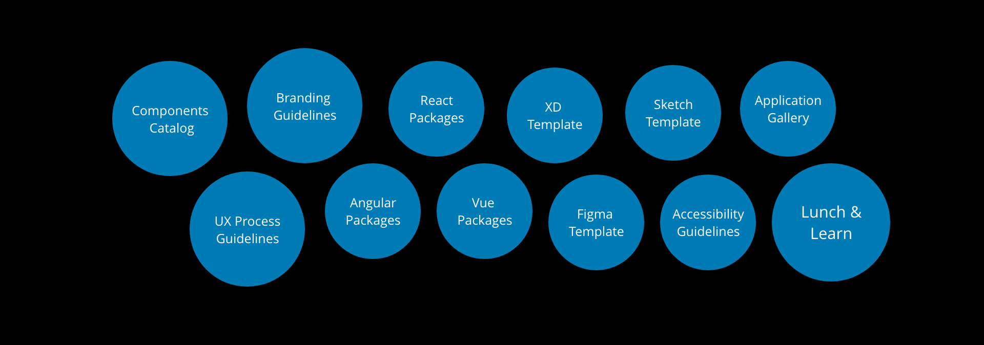
The Deliverables
A Complete Package
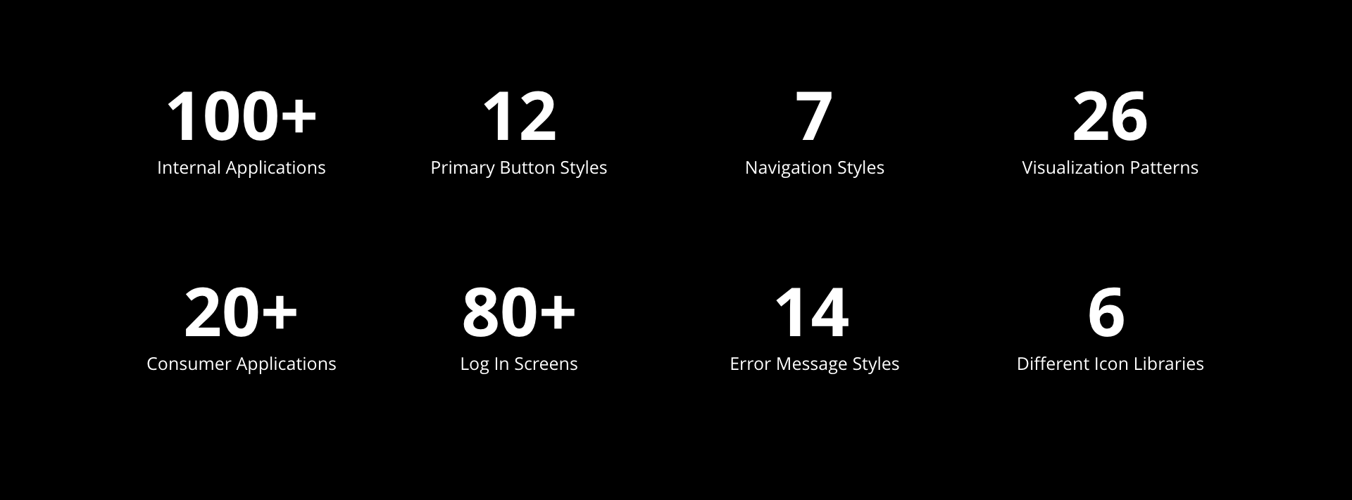
The Design System project in the end resulted in a deliverables package of templates and dosumentations. The following is the list of deliverables produced at the end of the peoject.
Work
RUGS USAProject type
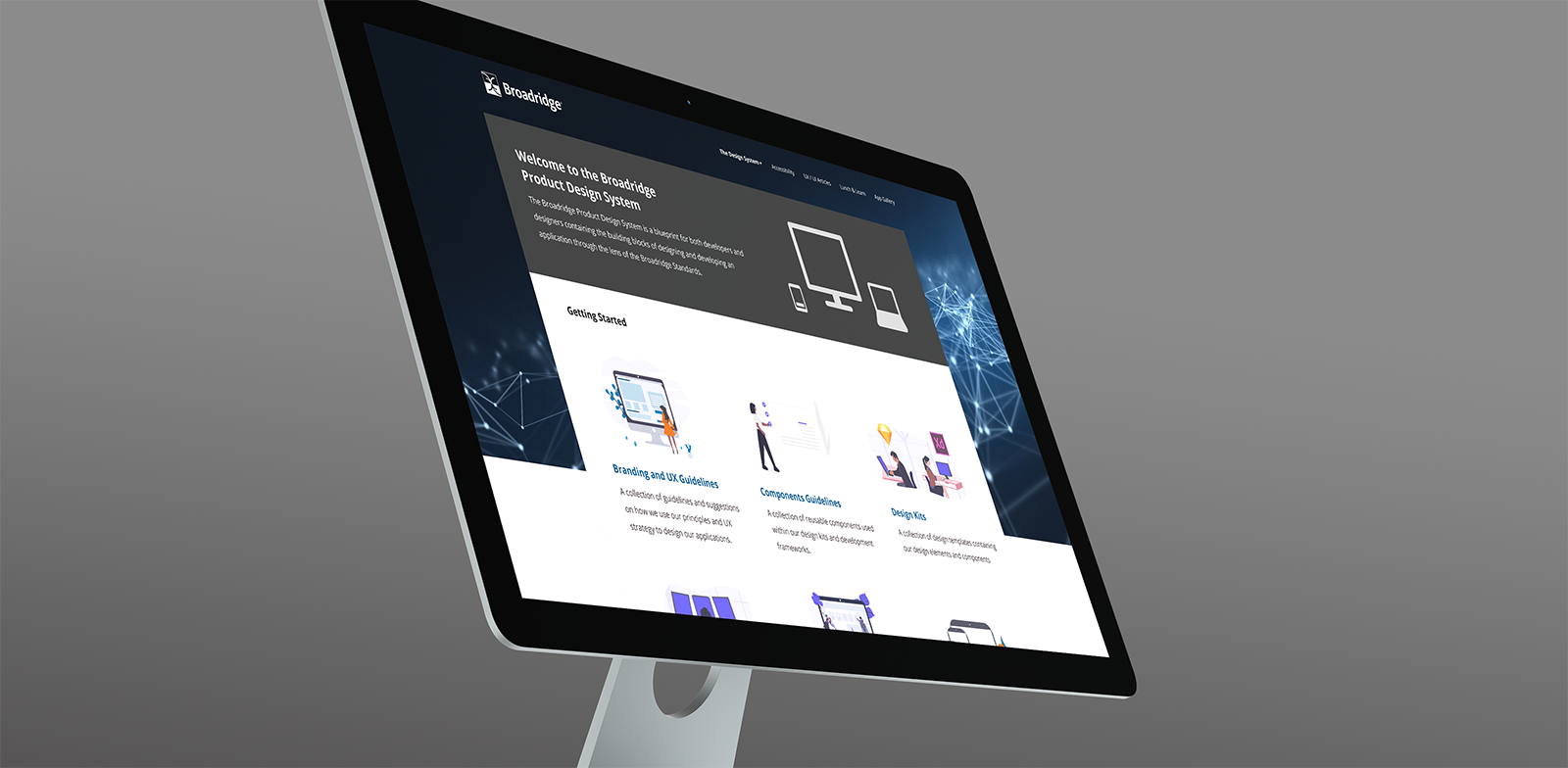
Broadridge Design SystemUX Design
Barber AppProject type
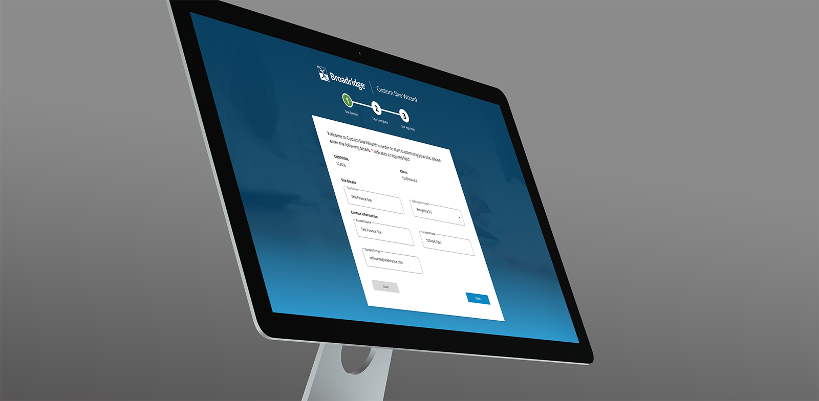
Custom Site WizardProject type
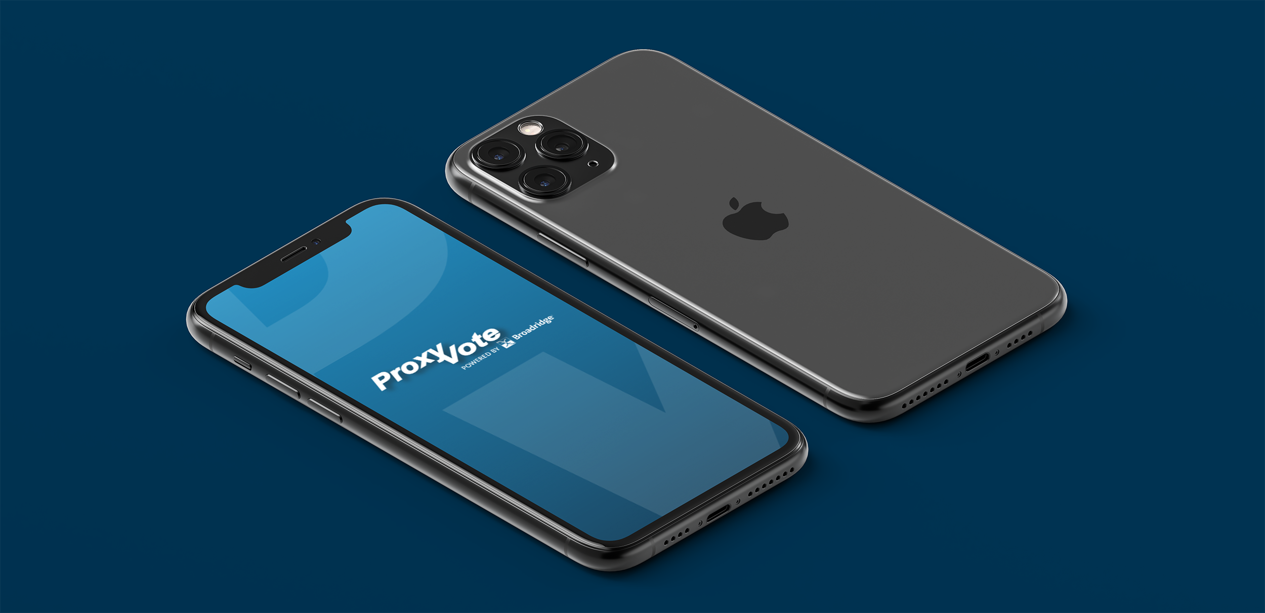
ProxyVoteProject type
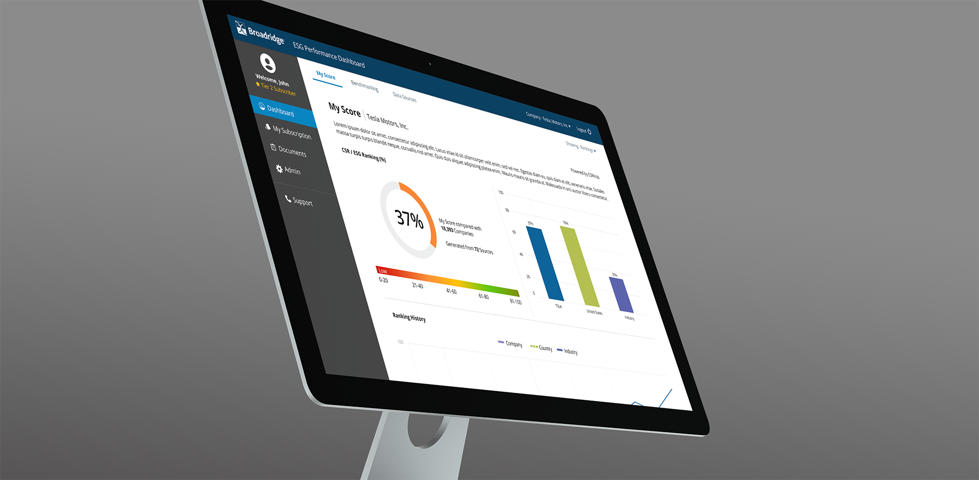
ESG Performance DashboardProject type
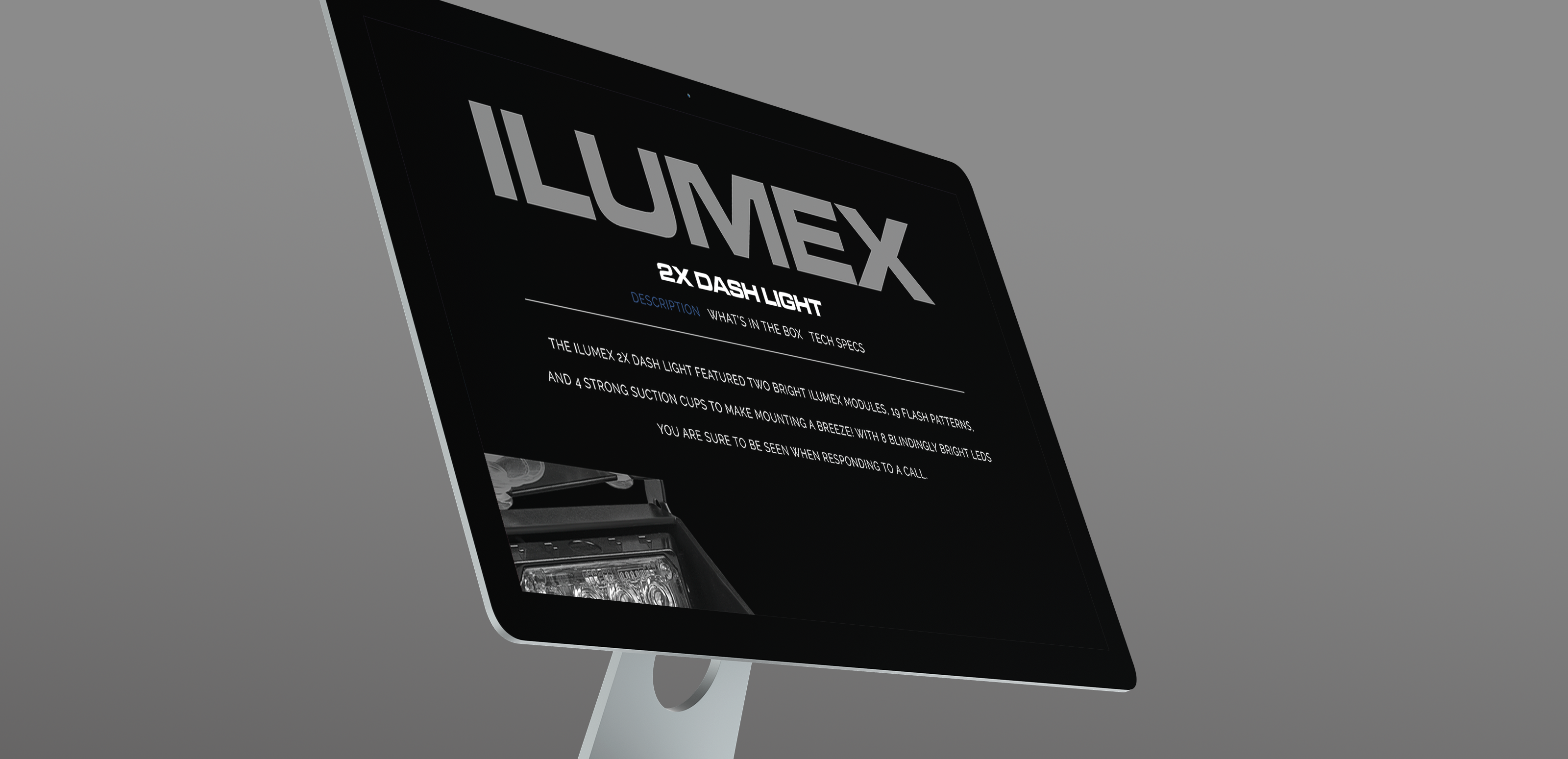
Ultra Bright LightzProject type